Designing Visual Mechanics in TTRPGs
Traditionally, visuals in actual TTRPG gameplay seem rather sparse. Of course, I don’t mean all the gorgeous and bountiful art that is meant to inspire players and sell books, that stuff is great (and also often gratuitous). But when it comes to visual mechanics, most of the time we are limited to maps. Putting a map’s art appeal aside, map visuals are mostly about space, obstacles, and distance. They remove flexibility for specificity and mesh well with tactics style games like traditional d20 systems. But If you’re like me and like to GM games that are very narrative-heavy and improvised, then you’ve long since thrown away your maps. As a result, TTRPGs often play out in our minds, melding and bashing against one another. Just as intended, right?
Yes, mostly. But for the past year I’ve been craving something a bit more tactile, yet short of LARP. I’ve been struggling with a tough question: how can we make our games more visual? And how can we do this without expecting our players to be artists? As much as I wanted to be an artist as a kid, I’m not quite there. But my hands crave some activity.
My restless hands led me to Runecaster (now live on Kickstarter!), which is a game about creatively combining runes to create powerful and unpredictable spells. A key feature of this game is that you can actually draw the runes of your spell, and I’ve been really surprised how that has transformed the way people play the game. I think Runecaster is both a great lesson in visual design and an interesting exploration of visual TTRPG mechanics that I hope future games can take and run with.
Designing a Visual Spell System
The tough part of designing a visual mechanic, in this case a spellcasting system, is that it actually needs to look good. What’s more, my visual design choices had impacts on how spellcasting would function. But to understand those choices, let me briefly explain how spellcasting in Runecaster works. Players combine up to three different runes to make a spell. There are nine total runes to choose from, each with their own cryptic meanings that are some combination of literal and metaphorical impacts. The chosen runes combine together to make a spell that the GM narrates, which often differs wildly from what the player intended. This system is very chaotic and relies on trial and error, as players figure out the GM’s brain: what combination of runes create certain spells? I went through three design styles In trying to figure out how these runes combined visually.
The first was a very classical rune pattern: a central rune with orbiting runes. I think most often in media runes are either a big single rune or a combination of a bunch of small runes, and this design combined both. The clear advantage of this technic was that it clearly vibes with our existing notions of runes. It also had the advantage of having a clear focus: the big rune would dictate what the spell is about. However, what about all those small runes? How many runes can you put in orbit, and how much of an impact would they have on the spell? I decided this created too much complexity in spellcasting, and it also meant a lot more drawing. At this point in the game’s design I wasn’t expecting players to draw every rune and spell, but I certainly would have been cursing myself if I had went with this style.
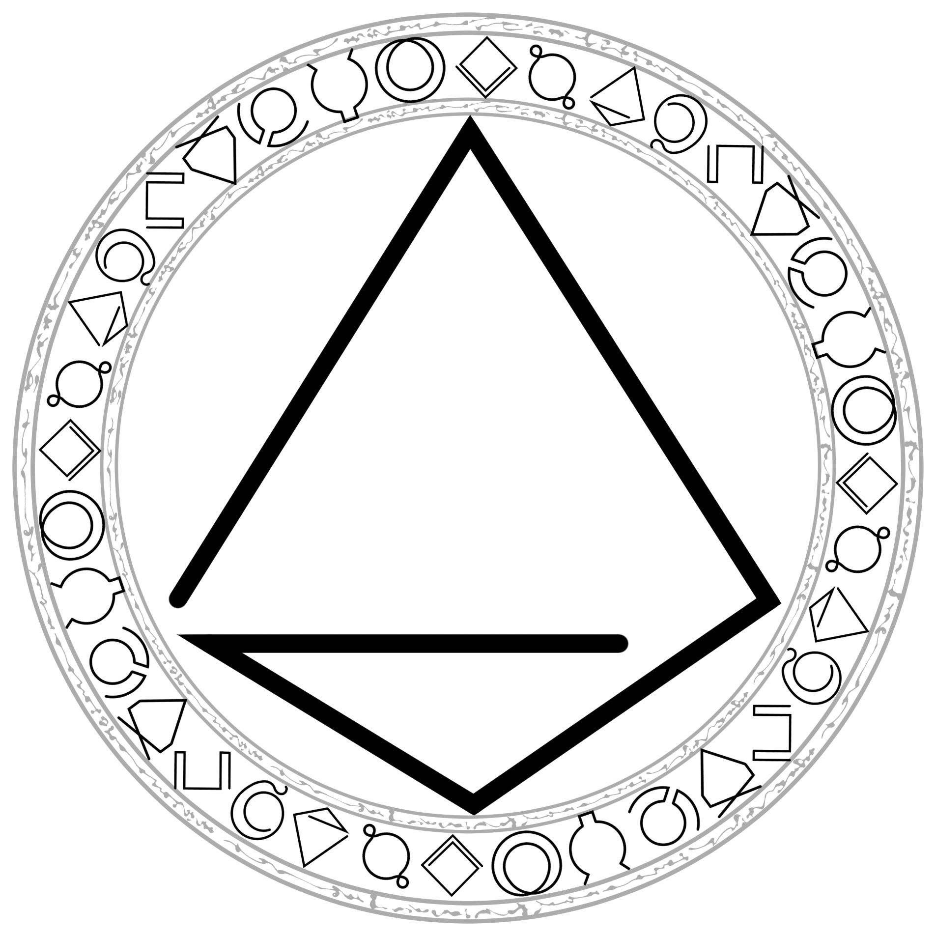
The second iteration introduced three rune sizes and put them in sort of a spiral pattern. Now I had a large, medium, and small rune. This added complexity because different rune sizes would impact the spell with corresponding differences in intensity: big means big effects and all that. While it was easier to draw, I think the different sizes looked pretty awkward in this style. When I made them equal sizes it looked much better, although it had a Holy Trinity ascetic. The downside is that now each rune was intuitively equal in its influence on the spell, and so some good complexity is lost. With three runes of equal size, that meant 219 different spell combinations. But with three runes of different sizes, there were now 819 combinations. Numbers aside, different sizes gave the players more levers to fiddle with, which is perfect for a game about experimentation.
Ok so sizes are good, and three runes give a lot of possibilities without too much choice paralysis. But how did I fit it all together? I ended up settling on concentric runes, so each rune fit inside another, with the biggest runes on the outside. The concentric rune system also brought a unique challenge for designing the runes themselves: runes had to fit a donut shape or else you could not stack them within each other. Honestly, the donut put some large bounds on the rune design. A donut shapes means you couldn’t do something like Nordic runes, which really look more like letters. It also meant I had clear limits on the angles and curves that would actually work, since I can’t cross the middle hole without throwing off any rune that would go inside. I also gave myself that design challenge that each rune needed to be able to be drawn in a single stroke of a pen, that way a full spell would take only three brush strokes. If I had to design more than nine runes, I might still be bashing my head against a wall, but I like how these turned out. I will concede however that the donut structure is probably not the most intuitive to draw; I don’t think we as non-artist humans can easily draw circles or avoid the center negative space.

At the suggestion of a playtester or two, I thought briefly about aligning the runes to a grid system that would make drawing them easier. Learning to write a new language is hard, after all! But I found that a grid system made the runes look too clunky. I’d rather have players make some sloppy runes that could be good (which is thematic given that players roleplay as rookie mages) than accurately draw runes that are subpar.
How Visuals Changed the Game
In the first playtests of the game, players didn’t draw out the runes. We were testing digitally, so the communal and physical aspects were missing. And honestly, the game ran perfectly smoothly. But when I took the game to Gen Con and began testing in person, using nifty little laminated drawing guides, the game ran better. In between turns, players now had something constructive to do with their hands. They were drawing runes and erasing them when they didn’t like them. And when they finally got to their turn, they would proudly show me their runes and cast their spell.
Having something tactile to do between turns helped to solve a bit of a flow conundrum when it comes to managing your attention in narrative games: you have to balance being invested in your character’s arc, the arcs of other player characters, and the wider narrative at play. Sure, when you’re in that flow state, this all feels natural. But oftentimes it’s easy to get wrapped up in the narrative of other characters, and then by the time it's your turn you haven’t even figured out what you want to do. Having a physical and visual task such as drawing runes provides a productive distraction. Something to doodle. Like a kid in a classroom! By the time it’s your turn, you’ve got a visual reminder of what you want to do. Like a student taking notes!
Of course, the challenge of these kinds of mechanics is to make sure it doesn’t feel like a chore. I think I avoided this in Runecaster, especially since drawing the runes ultimately is optional, but the line is there and could be easily crossed. If you waste a player’s time, you should expect them to stop playing the game. Strangely, a great way to assess time wasting is how often players are looking at their phones, which is a problem I have testing other systems (or playing most games, for that matter). Of course, we’d all like to be fully engaged with a game all the time, but our lives these days are engineered to distract us. I was surprised to find that Runecaster playtesters were rarely on their phones, because rune drawing provided that same fiddling distraction. My teacher heart soared!
But does Runecaster’s drawing mechanic improve the immersion of the game? I’d like to think so, although I admit immersion is an elusive goal. Drawing runes pulls the visuals of spell making through the 4th wall and onto the table. You as a player get to see and draw the actual runes that your character sees and draws. Seeing the runes makes you wonder things like, “What if I drew this rune differently?” which then naturally feeds into a progression mechanic called a Thesis, where players can research new modifiers for their spells. But the big fireball stays in the fantasy…for now.
Ultimately, Runecaster is just one game, but I think it demonstrates that there is something “there” when it comes to visual mechanics, and I have only scratched the surface. I believe that new and returning indie devs should be constantly trying to shake up the TTRPG experience, and I think visual game mechanics could have a lot of potential to do so. I couldn’t tell you what’s next for visual mechanics, but I hope you can show me!
This article is part of the Indie Game Developer Network’s blog series. The content of this article reflects the views of but one member of the IGDN. This IGDN blog article is brought to you by Wes Zebrowski of Pangur Ban Collective. If you want to get in touch with the contributor they can be reached on BlueSky at @pangyban.bsky.social. Their game Runecaster went live on Kickstarter on January 6th, and you can follow or back it here: https://www.kickstarter.com/projects/pangurbancollective/runecaster-a-narrative-ttrpg-of-magical-experimentation?ref=cb3umb